Illustration XXXV: Notes from a Digital Nomad
Drawing with Old Photos

There's something about the contrast between the precise architectural lines and the soft, organic circles that just works for me. The little village/town sketch was something I'd done earlier, but adding those vibrant transparent overlays transformed it completely.
My Version of Proof of Vaccination

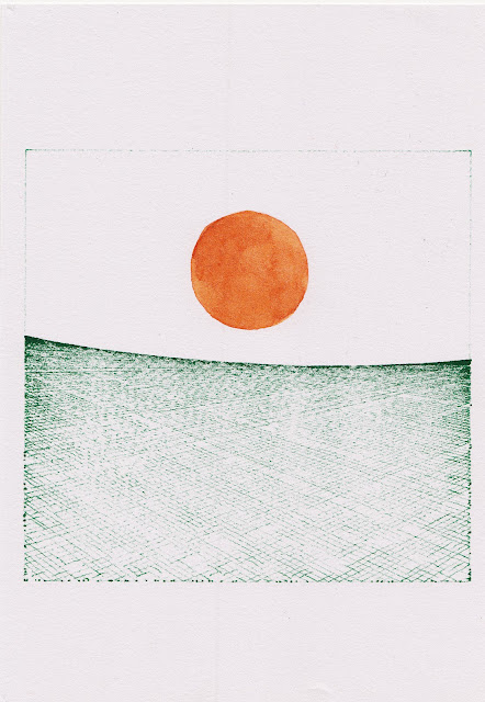
Rather than the boring still they you use as a screensaver, I made this. Ended up liking it enough to save it from the digital trash heap.
This was one of those pieces that emerged from frustration - why do important documents always have to look so utilitarian and ugly? Sometimes I just need to redesign things that annoy me.
New Haircut

The gradient hair flowing into those digital/geometric elements creates this nice tension between the organic and the constructed. Added the QR code as a commentary on how we're all constantly caught between physical and digital existence now.
The bright yellow background was a deliberate choice to create that jarring, almost uncomfortable contrast with the softer figure. Sometimes discomfort is exactly what an image needs.
Mumbai to Peshawar
A cover I made for my brother's book - Mumbai to Peshawar. As a client I failed, as he imagined something more melancholic and direct, but I suggested this instead.

The "26/11" reference points to the 2008 Mumbai attacks, which I'm guessing is central to the book's theme. I wanted to create something that balanced the gravity of the subject matter with a certain visual dignity - hence the restrained typography against that textured background.
That subtle golden circle against the red creates a focal point that draws the eye without being explicit about what it represents. Sometimes suggestion is more powerful than direct representation.
My brother probably wanted something more literal, but I'm still proud of how this turned out. Sometimes family are the toughest clients.
Created this during one of those 3 AM can't-sleep sessions that sometimes produce my favorite work.
Always Just Warming Up

Used an old photo of mine for reference. This was literally just me warming up before starting on a client project, but sometimes those throwaway exercises end up being more interesting than the "real" work.
There's something meditative about drawing plants - all those organic curves and natural patterns that never quite repeat themselves. The circular composition creates this nice sense of completeness, like a little self-contained world.
The limited color palette (just various shades of green against that dark background) was partly laziness, partly intentional restraint. Sometimes restrictions produce better results than unlimited options.
I've found myself coming back to this one repeatedly, which is always a good sign. Might develop it further into something more elaborate, or maybe it's perfect as this simple study. We'll see.
What's Next?
Working on some animation experiments that are either going to be brilliant or make me rage-quit my software again. Also playing with that suspended figure concept some more - thinking about creating a whole series with different emotional states represented through posture and color.
Until next time, keep making weird stuff,
— Your friendly neighborhood digital nomad illustrator
Check out the next illustration Blogpost, Illustration: XXXVI ➡


Comments
Post a Comment